Show the energy you generate
Seeing how much energy you generate and use is a great way to share your efforts with others. It can also help you develop a strategy for saving money and lowering your carbon footprint over time.
SolarNetwork not only collects your energy data, it makes it easy to translate that data into interactive graphics that make your energy story come alive.
We can help you get the message out
SolarNetwork Foundation can work with you to design and build a custom dashboard, kiosk, mobile app, or learning tool to convey the benefits of your energy system to the world. We can also help you integrate real-time data and interactive visualizations into your own website or app.
Sharing your energy story is a great way to proudly demonstrate your sustainability credentials. What are you waiting for? Show off your power!
Here’s an example of what we’re talking about
This graphic shows several ways of understanding the energy data collected by SolarNetwork from one building fitted with solar panels.
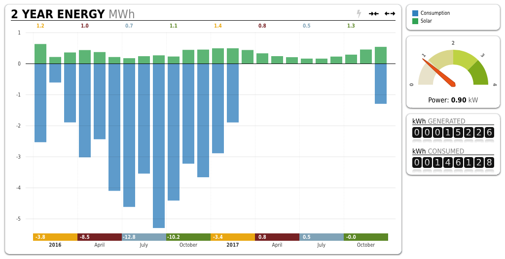
The main chart shows monthly energy data over a two-year period, with solar power generation represented above the horizontal axis in green, and power use below the axis in blue.
The gauge on the top right shows real-time power generation from the solar panels.
The image on the bottom right shows the total amount of energy generated by the solar panels and the total amount of energy used by the building, since tracking with SolarNetwork began.