Understand how you use energy
We can help you understand where you use energy, plan for changes like adding a solar system, and the effects of any changes you make.
Power bills are one way to understand how much energy you are using, but the information they provide is too brief and comes too late to answer many questions about your energy use.
You might ask:
- When do I use the most energy?
- What appliance uses the most energy in my building?
- What does my energy use look like over a typical week or day?
- Do I use more energy on rainy days?
- How would rooftop solar affect my power bill?
An energy audit using SolarNetwork can help
SolarNetwork can help you get to the bottom of these questions with an energy audit. We will:
- install a SolarNode, along with power meter(s), to gather data about your power use
- gather data about your power generation (if you already have solar)
- enable you to see your power use (and generation) in real-time in a web browser
- help you analyse the data you collect and provide answers to your original questions
Using SolarNetwork, not only can you measure your whole building’s energy use, you can break down your energy use by function - such as hot water use, lighting, heating, or refrigeration. You can overlay information about local weather, electricity markets, and solar generation to make the data relevant to you. Patterns become evident as they develop, in real time, rather than being a surprise at the end of the month when the power bill arrives.
Make better energy decisions
With an energy audit, SolarNetwork Foundation can use the data you collect in SolarNetwork to help you discover patterns in your energy use . We can use that information to help you make informed decisions to lower your power bill, make better use of renewable energy, and share your experience with others.
Here’s an example of what we’re talking about
We worked with a primary school, that already had solar panels, to track the school’s energy generation and use. We installed a SolarNode and a power meter, and configured the node to capture data from both the meter and the solar panels. We developed an interactive web app that showed the school’s energy use and generation in real-time. We then worked with teachers to develop an “energy data science” curriculum, and gave a presentation to the students to help kick start their learning.
The following screen captures from the web app show the school’s average seasonal energy generation and use:
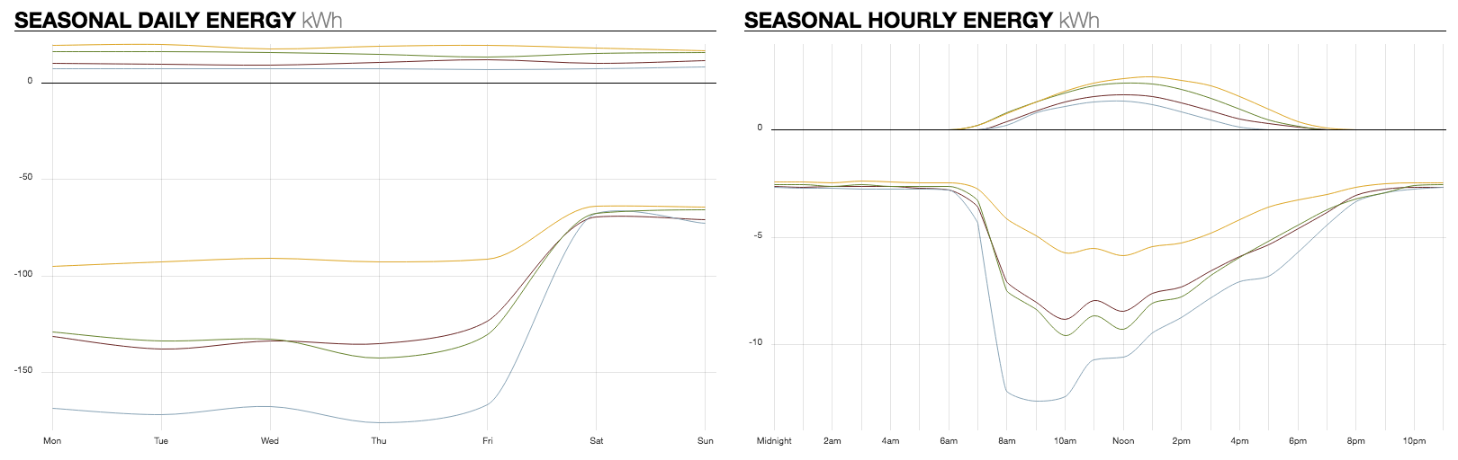
Power generation is shown above the horizontal axis, so higher lines represent more power generation. Power use is shown below the horizontal axis, so lower lines represent more power use. Yellow lines represent summer, burgundy lines autumn, blue lines winter, and green lines spring.
The chart on the left shows average power generation and use per day of the week. You can immediately see that the school uses much less power on weekends, when students are not present.
The chart on the right shows averages per hour of the day. You can see that in winter far more power is used, most of it between 8-11 in morning. This was attributed to electric heating, which used a good deal of energy to warm the school up at the start of each day.